By nobu
Sustainable packaging for restaurant quality sauces.
Logo | Product Design | Packaging | Sustainability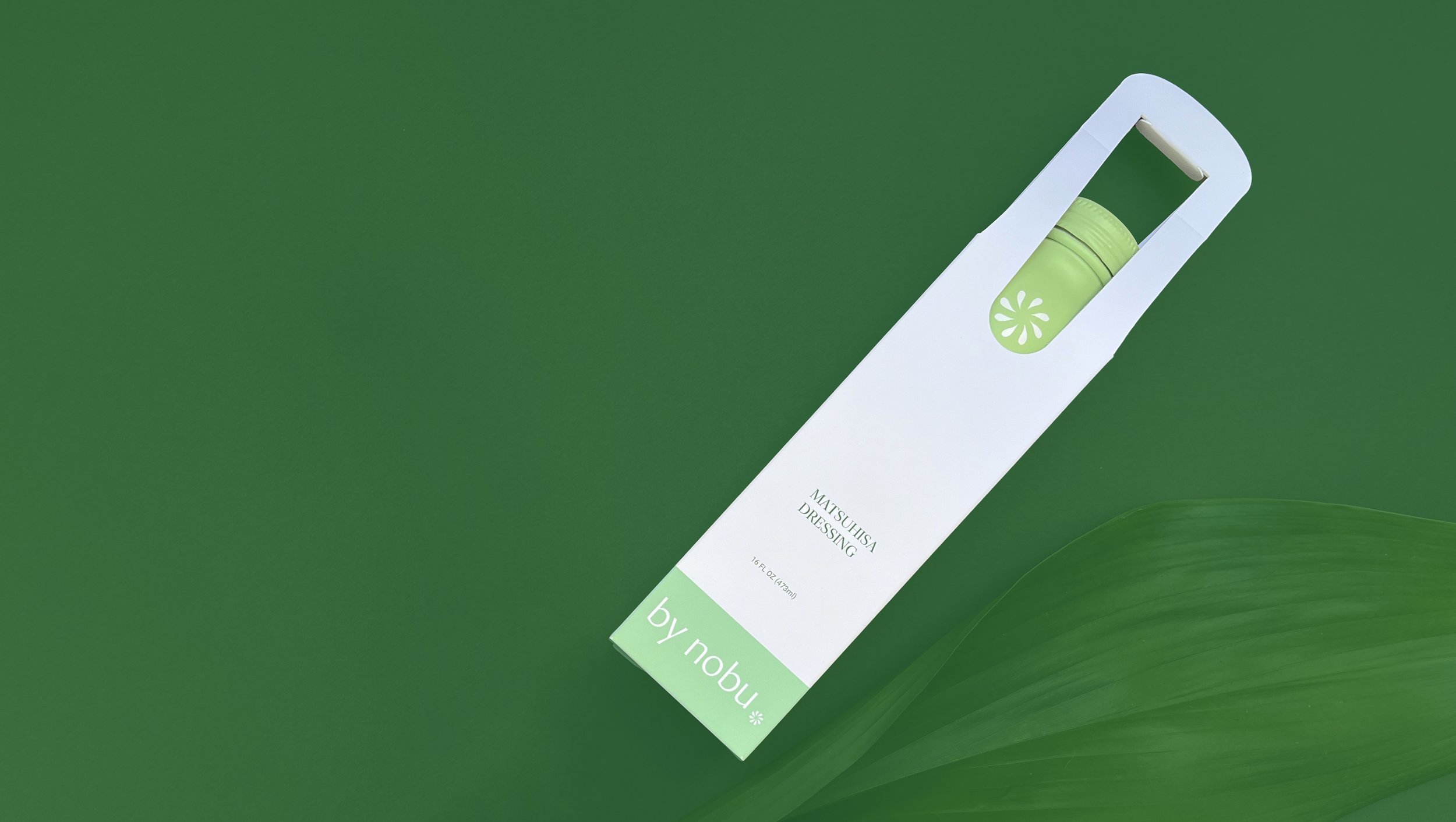
-
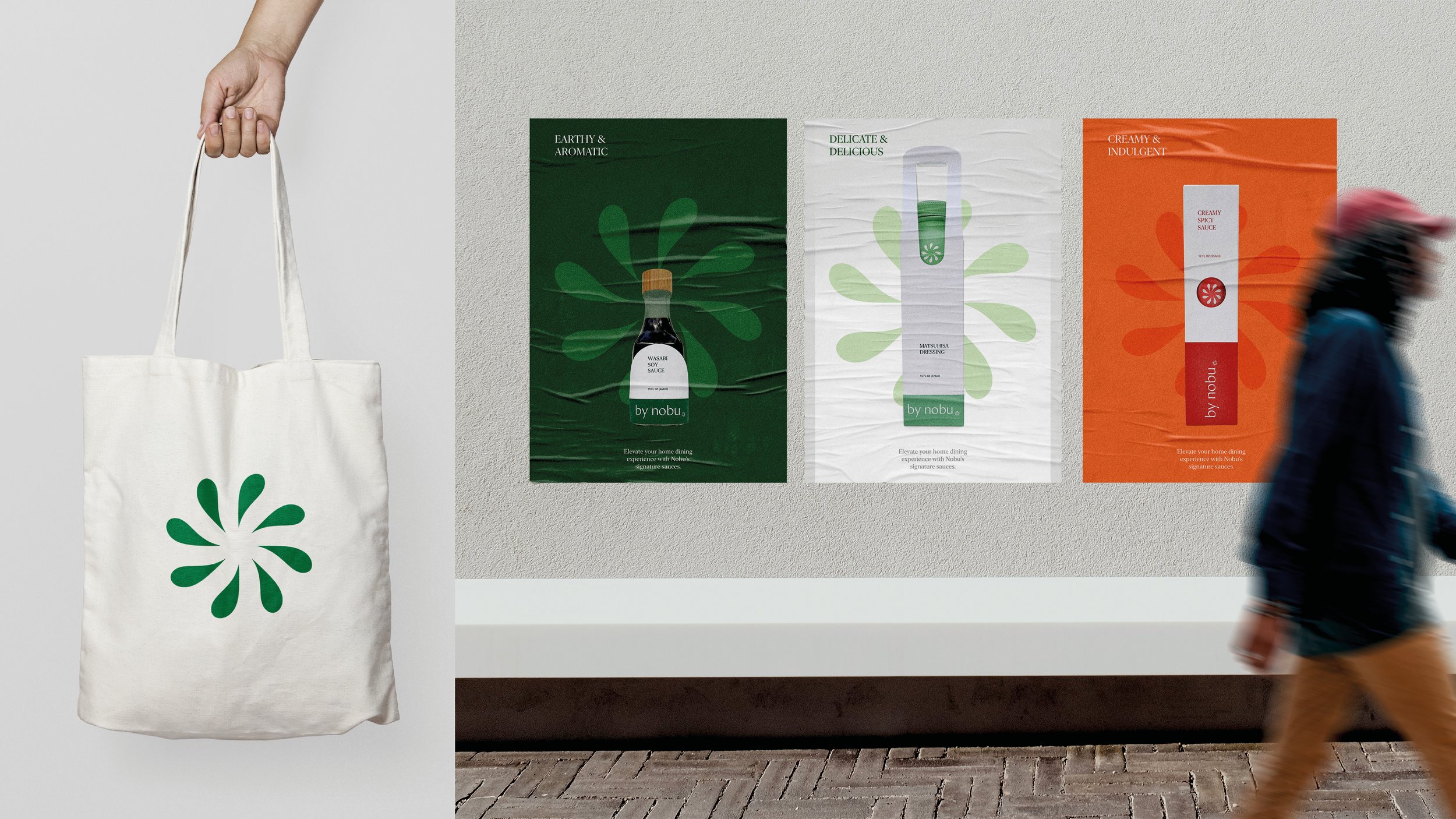
Many recipes on Nobu's website require staples that are uncommon in many U.S. households. This product proposal aims to offer a diverse range of restaurant-quality sauces that appeal to people in the U.S. who frequently dine out to enjoy Asian cuisine.
-
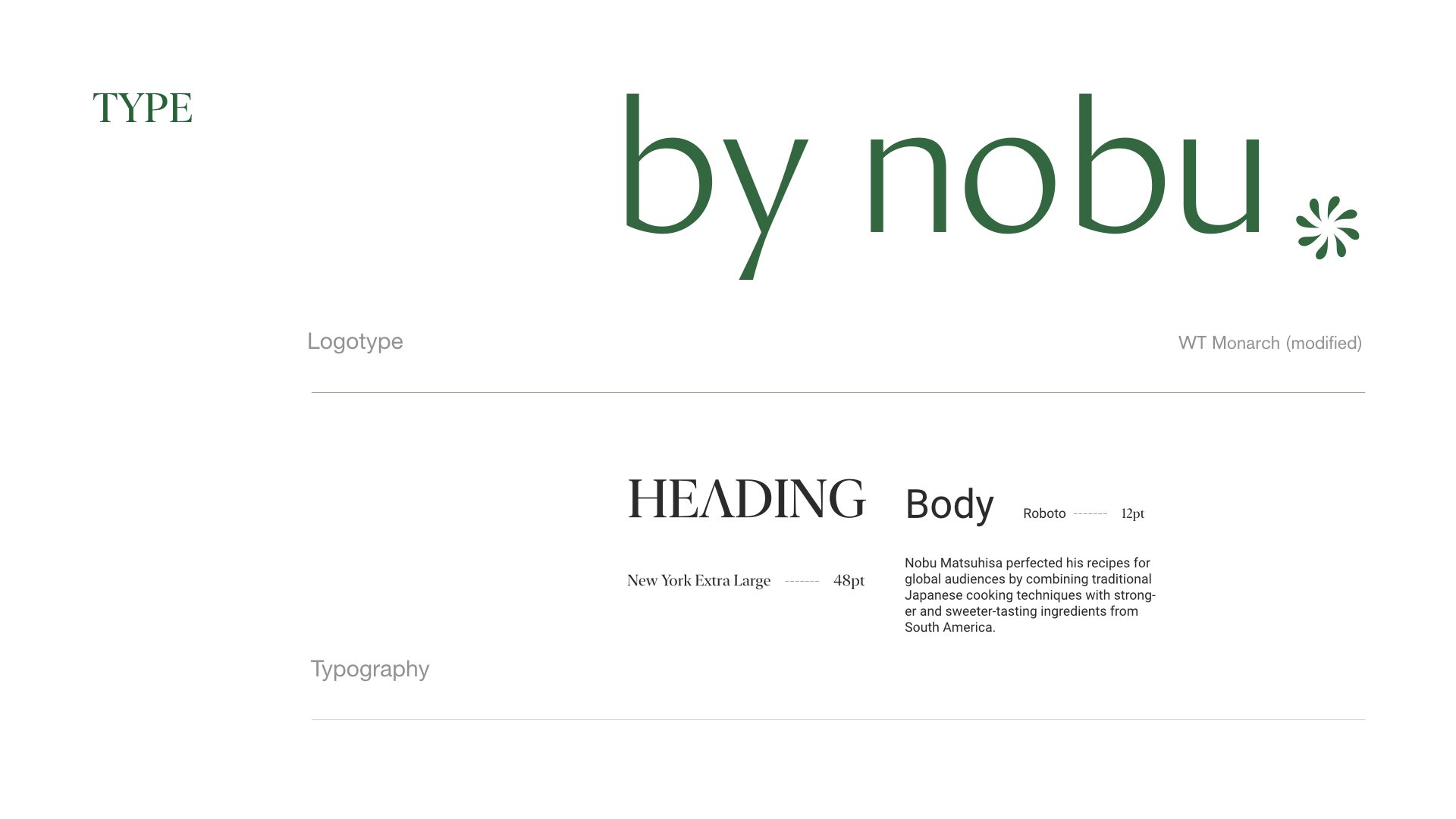
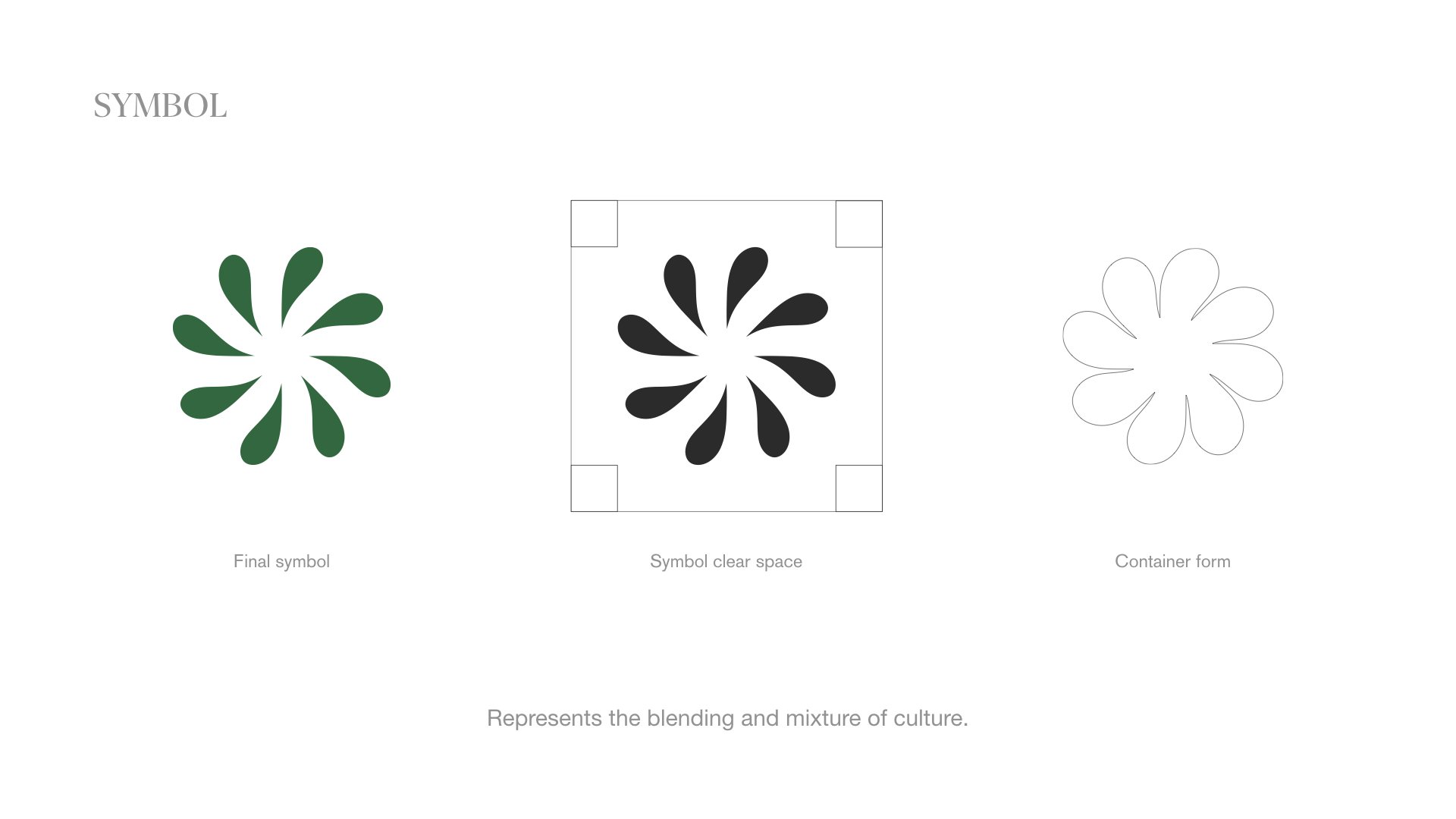
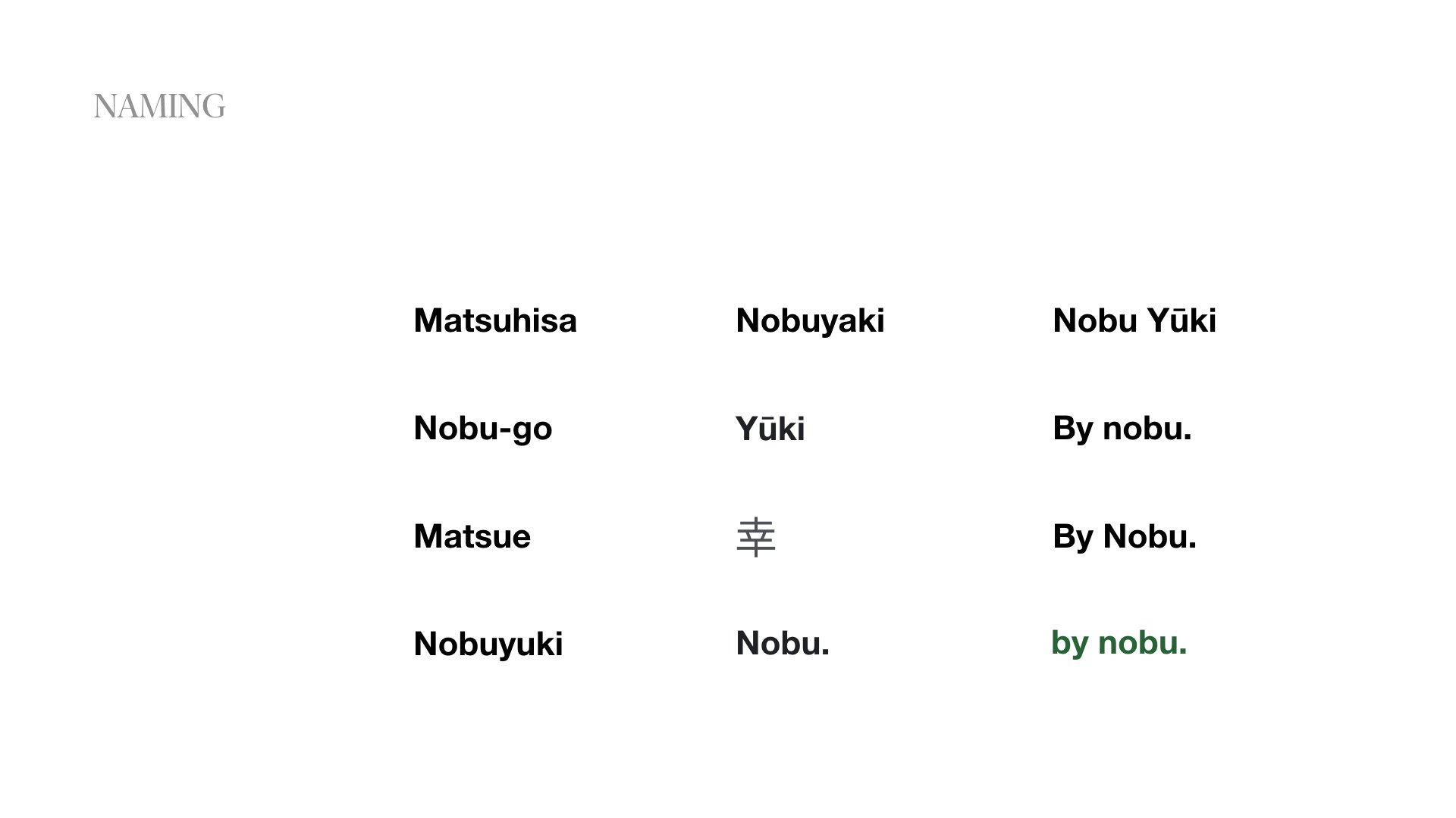
The symbol represents the blending of Japanese and Peruvian cultures. What stands out about Nobu's food is its simplicity and elegance, which I reflected in the high-contrast logotype and minimal typography.
-
Eighty-six percent of consumers under 45 are willing to pay more for sustainable packaging. For this reason, I chose to use only sustainable materials in the packaging solutions, such as paper, aluminum, and wood.


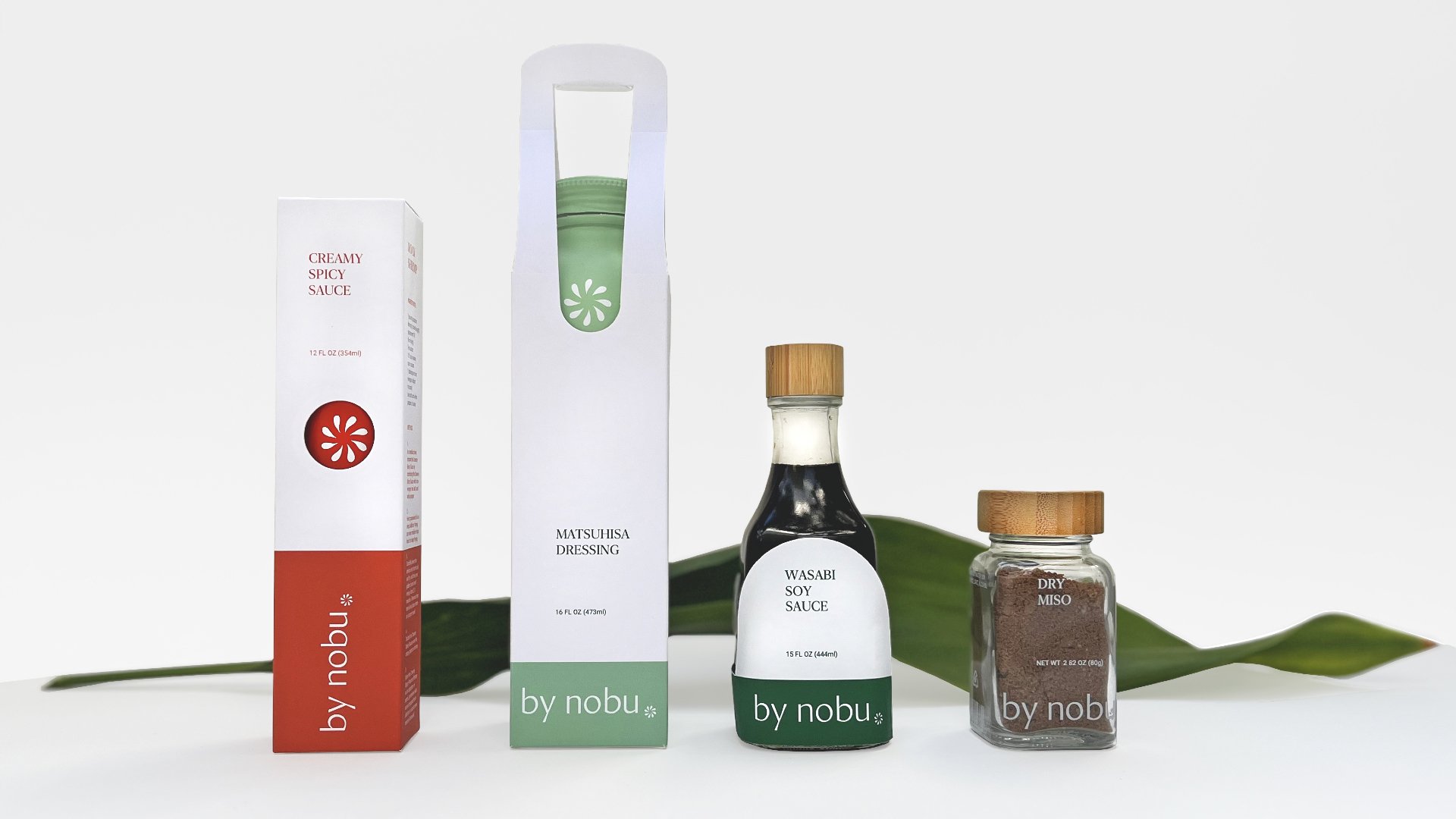
Custom Dieline

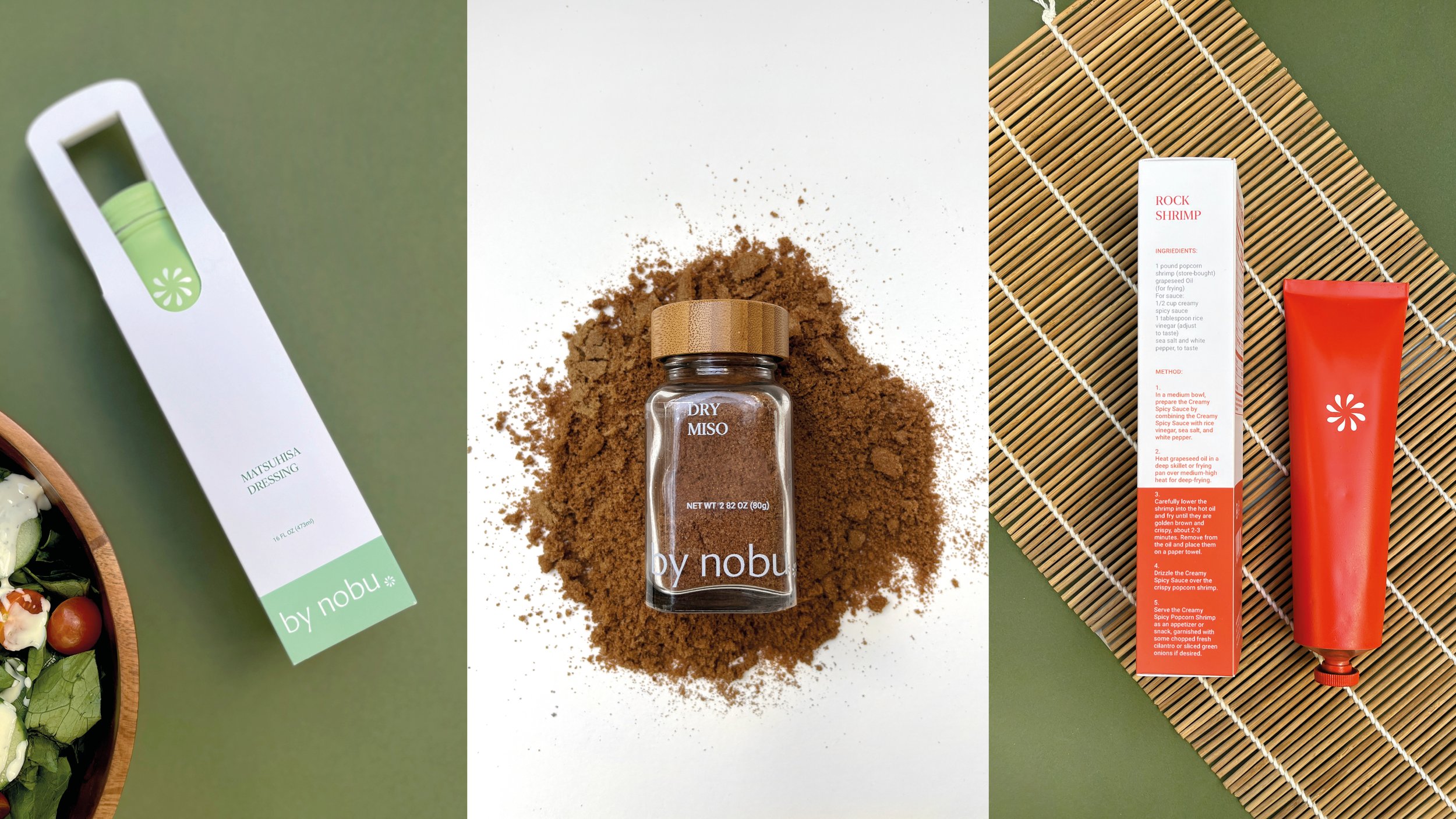
The inspiration behind this design is rooted in sustainability. One factor that could deter consumers from reusing an aluminum bottle is the presence of stickers or direct printing on it. By designing a sleeve packaging for the bottle, customers would be more inclined to keep the bottle after use and simply dispose of the outer packaging.
Folding Carton | Custom Dieline
Sustainable Materials


Digital


Promotional